Analytics
SaaS Metrics Dashboard: Essential Metrics to Track in 2026

A SaaS dashboard should answer three questions: Is recurring revenue growing? Are customers staying? Can the company acquire and serve them efficiently?
Many dashboards obscure those answers with sign-ups, support tickets, website traffic and product events competing for attention. A better SaaS metrics dashboard starts with commercial outcomes, shows what caused them to move and gives teams somewhere to investigate the detail.
What metrics should a SaaS dashboard include?
The exact metrics depend on the business model, but most SaaS companies need a combination of revenue, retention, acquisition, product and efficiency measures.

| Metric | What it tells you | Useful visual |
|---|---|---|
| ARR / MRR | Recurring revenue scale and growth | KPI and trend |
| Revenue movement | Where recurring revenue growth comes from | Revenue bridge / waterfall |
| GRR | Revenue retained before expansion | KPI and trend |
| NRR | Retention including expansion revenue | KPI and trend |
| Customer churn | How many customers are leaving | Trend and cohort |
| Retention | How customers or revenue behave over time | Cohort heatmap |
| CAC | Cost of acquiring customers | Trend and channel comparison |
| CAC payback | Time needed to recover acquisition costs | KPI and trend |
| Activation | Whether new customers reach meaningful value | Funnel or cohort |
| Gross margin | Economics of delivering the service | KPI and trend |
The dashboard does not need to show all of these at the same level. Executive metrics should provide the headline, while supporting views explain why they moved.
Choose SaaS metrics based on decisions, not availability
There is no universal set of SaaS metrics. A self-service product with monthly subscriptions faces different questions from an enterprise platform with annual contracts and a long sales cycle.
Start with the decisions the dashboard needs to support:
- Is growth coming from new customers or existing accounts?
- Which customer groups are leaving?
- Is acquisition becoming more expensive?
- Are new users reaching a meaningful outcome?
- Which behaviours appear alongside retention or expansion?
Agree the definitions before building charts. “Customer”, “active user” and “churn” often mean different things across finance, product and billing systems.
A customer could be a contracted company, a workspace or a billing account. Putting conflicting figures on one screen creates the appearance of alignment, not the reality.
Track ARR, MRR and recurring revenue movement
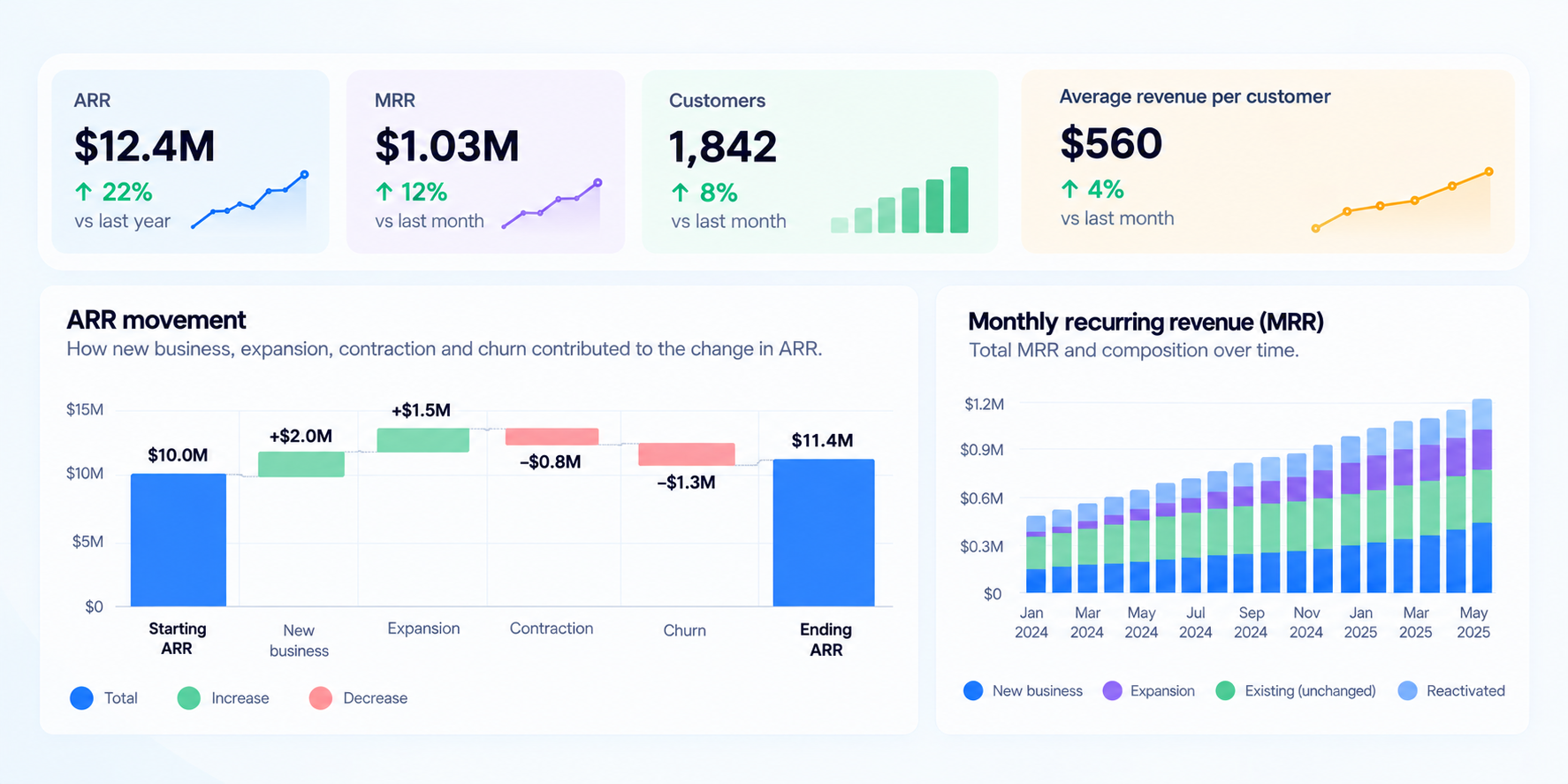
Annual recurring revenue gives subscription businesses an annualised view of recurring revenue, while monthly recurring revenue provides a more responsive view of shorter-term movement.
Companies with fast-changing monthly subscriptions may rely more heavily on MRR, while ARR is often useful for executive and strategic reporting.
Show the current figure alongside its growth rate and historical trend. The total alone can hide slowing momentum.
Benchmarks only help when the comparison group resembles the company. SaaS Capital’s 2026 survey of private B2B SaaS companies reported median annual growth of 22%. Its narrower study of bootstrapped B2B SaaS companies with $3 million to $20 million in ARR found median growth of 15%.
Company size, funding and market make these two figures different reference points, not interchangeable targets.
Alongside ARR or MRR, add a revenue bridge separating:
- New recurring revenue
- Expansion from existing customers
- Contraction
- Churn
A 10% ARR increase could come from strong sales offset by heavy churn, or modest sales supported by reliable expansion. The headline is the same. The response is not.
Track NRR, GRR, churn and retention cohorts together
Gross revenue retention shows how much recurring revenue remains after churn and contraction but before expansion.
A simplified formula is:
GRR = (Starting recurring revenue − churn − contraction) ÷ starting recurring revenue × 100
Net revenue retention includes expansion from existing customers:
NRR = (Starting recurring revenue + expansion − churn − contraction) ÷ starting recurring revenue × 100
Together, GRR and NRR show whether the existing customer base is stable and whether it can contribute to growth.
Weak GRR can be hidden by strong expansion. That may produce acceptable NRR while a small group of growing accounts compensates for losses elsewhere.
Customer churn adds another perspective because it measures the number or proportion of customers leaving rather than only the revenue lost. Losing several small accounts can have a limited short-term impact on revenue while still revealing problems with onboarding, product fit or a particular customer segment.
ChartMogul’s analysis of 3,500 software companies with at least $250,000 in ARR reported median annualised NRR during 2025 of 82% for B2B SaaS, 49% for B2C SaaS and 48% for AI-native companies.
The difference shows why a broad SaaS benchmark can mislead when business models and customer types differ.
Use two main retention views:
- GRR, NRR and churn trends to show whether revenue and the customer base are becoming more durable.
- Retention cohorts grouped by starting month or quarter to show how customer or revenue retention changes as each cohort ages.
Cohorts expose problems hidden by averages.
If newer customers leave faster, acquisition mix or onboarding may have changed. If most losses occur in the first few months, early activation deserves more attention than long-term engagement.
Segment retention only where it could change a decision, such as by plan, customer size, channel or use case.
Connect CAC and CAC payback to recurring revenue
Customer acquisition cost means little without the value and timing of the revenue it produces.
Show CAC alongside CAC payback, which estimates how long it takes for gross profit generated by a customer to recover the cost of acquiring them.
Trends matter more than isolated values because they reveal whether growth is becoming more expensive.
Benchmarkit’s SaaS benchmarking research covers metrics including CAC payback, new-customer CAC ratio, LTV, the SaaS Magic Number, gross margin and ARR per employee (Benchmarkit SaaS benchmarks).
Putting every efficiency measure on the main dashboard would add repetition rather than insight. CAC payback and one broader sales-efficiency measure are usually enough for an executive view.
Avoid relying only on blended CAC.
Partner referrals might produce fewer customers with fast payback, while paid campaigns add more volume at a much higher cost. The blended figure can remain stable while the acquisition mix deteriorates.
Show acquisition volume and efficiency by channel or sales motion in the operating view.
LTV is also sensitive to assumptions about retention, customer lifetime and gross margin. CAC payback is often easier to interpret because it answers a more concrete question: when does the company recover the cost of acquiring a customer?
Use activation and engagement to explain retention
Revenue and retention show what happened. Product data can help explain why.
For B2B SaaS, a useful sequence is acquisition, activation, engagement and retention. Amplitude’s B2B product benchmark report recommends tracking these stages and connecting product usage with SaaS outcomes.
Activation should represent a meaningful step towards receiving value.
Account creation rarely qualifies.
Depending on the product, activation could mean:
- Connecting a data source
- Inviting colleagues
- Publishing the first project
- Completing the first transaction
- Running the first core workflow
Track both activation rate and time to activation. The percentage of activated customers may remain stable even while customers take twice as long to reach the same outcome.
Engagement should also reflect the product’s natural rhythm.
Daily active users might suit a communication tool but say little about software used for monthly reporting. Instead, look at:
- How often relevant users return
- Whether they complete the core workflow
- Whether usage spreads across seats or teams
- Whether customers adopt important features
- Whether product behaviour differs between retained and churned customers
The aim is to find behaviour associated with retention or expansion, not to maximise activity.
Amplitude describes Atlassian analysing features used by high-retention Jira users. Patterns like these can inform onboarding and product education, although they do not prove that using a particular feature caused customers to stay.
Add gross margin and efficiency metrics
Growth can remain strong while the underlying economics worsen.
Gross margin shows how much revenue remains after the direct costs of providing the service. Alongside it, metrics such as the Rule of 40 and ARR per employee can provide wider context on growth and operating efficiency.
The Rule of 40 combines a company's revenue growth rate and profit margin to provide a high-level view of the trade-off between growth and profitability.
ARR per employee can provide another view of operating efficiency, particularly when tracked over time or compared with businesses at a similar stage.
These measures appear in Benchmarkit’s SaaS performance benchmarks.
Keep strategic efficiency metrics on an executive dashboard rather than a daily product view.
Financial metrics also update at a different pace from product events. If sign-ups update in real time, revenue overnight and gross margin after the monthly close, display the reporting period and last refresh date for each.
Otherwise, people may compare figures that do not describe the same period.
Build the SaaS dashboard in three layers
A useful SaaS dashboard does not need to fit everything onto one screen. A practical structure has three levels.
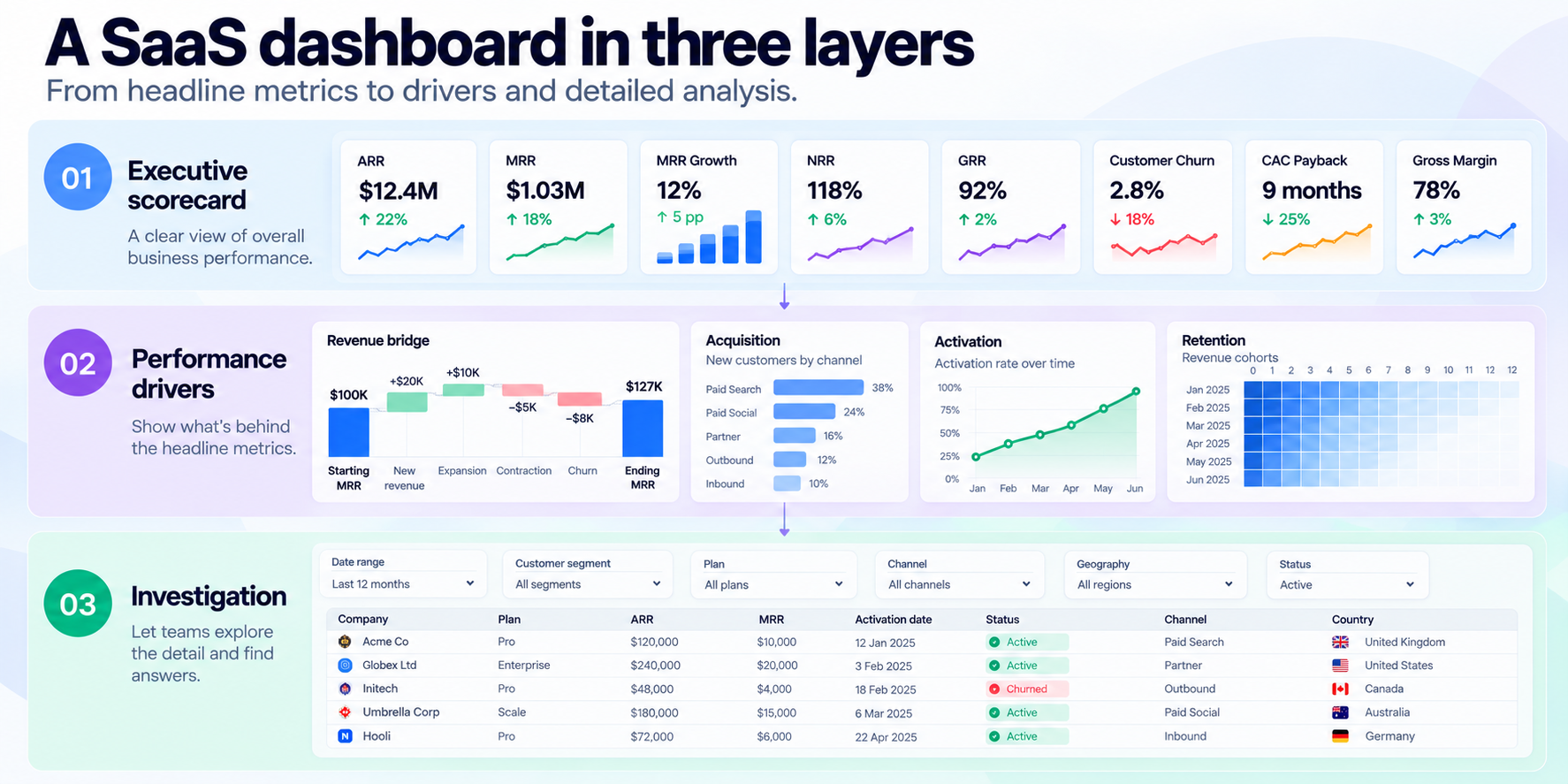
1. Executive scorecard
Show the metrics that describe overall business performance:
- ARR or MRR
- Recurring revenue growth
- GRR
- NRR
- Customer churn
- CAC payback
- Gross margin
Each should include a trend, comparison or relevant context rather than appearing as an isolated number.
2. Performance drivers
Show what caused the headline metrics to move:
- Revenue bridge
- Retention cohorts
- Acquisition by channel
- CAC by channel or sales motion
- Activation trends
- Product engagement
- Expansion and contraction
This layer connects business outcomes with the behaviours and operational changes behind them.
3. Investigation
Give teams somewhere to explore the detail.
Useful filters might include:
- Customer segment
- Plan
- Geography
- Acquisition source
- Sales motion
- Cohort
- Industry
- Customer size
Where appropriate, teams should also be able to move from aggregated metrics to relevant account-level detail.
This structure avoids two common failures: a dashboard too crowded to scan and a polished scorecard that shows something went wrong without helping anyone understand why.
Make every SaaS metric traceable and consistent
Document how each metric is calculated, which system supplies it, how often it refreshes and who owns the definition.
Without this, teams spend meetings debating the number instead of deciding what to do about it.
The same discipline should apply to benchmarks.
Benchmarkit segments performance by factors including company size, average contract value, pricing, funding and go-to-market motion. SaaS Capital reports different growth figures for private B2B SaaS companies overall and for narrower cohorts such as bootstrapped businesses.
Those distinctions matter more than any universal target.
A useful SaaS dashboard should therefore contain the smallest connected set of metrics that describes commercial performance, explains movement and gives teams somewhere to investigate.
If a metric cannot inform a decision, explain another result or expose a meaningful risk, it probably does not belong on the dashboard.
Turn your data into trusted answers
Build governed metrics, explore your data, and create dashboards with Metricwise.
Get Started